For partners, guests & collaborators
Brand Standards
A practical guide to representing The Business Growth Factor consistently, logos, colors, type, voice, and how to use them on the page, the screen, or wherever our name shows up.
Our Brand
The Business Growth Factor is a podcast and private online community for growth-minded business leaders. Co-hosted by Lyndon Smith and Joshua Leyenhorst, we explore the strategic, financial, and operational systems that help small and mid-sized businesses move from chaos to control and scale with confidence.
Our brand should always feel practical, professional, and grounded, the way a trusted advisor speaks. Confident without being loud. Optimistic without being naïve.
Name
The Business Growth Factor
Always written in full on first reference. "TBGF" is acceptable shorthand internally.
Tagline
Conversations about Building Better Businesses
Primary tagline. Keep the "Building Better Businesses" alliteration intact, always "about" (not "on") and plural. Use sentence-case in body copy.
Motto
Build · Grow · Learn
Set in all-caps with wide tracking. Use as a closing line or banner accent.
Logo system
The Business Growth Factor identity is a tight system of four marks, each built for a specific context. Pick the variant that fits where you're placing it. Don't recombine or recolour them.
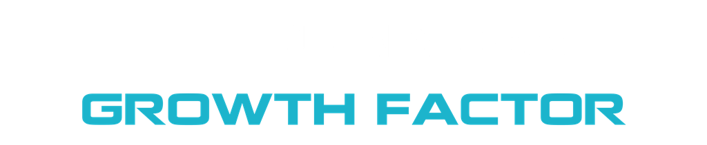
1. Wordmark (primary)
The stacked typographic mark. Use this anywhere you'd traditionally place a logo: site header, presentation title slides, printed material, email signatures. This is the default lockup.
On Light
Black on top, Azure on the bottom row. Transparent background.
logo-wordmark-light.png
On Dark
White on top, Azure on the bottom row. Transparent background.
logo-wordmark-dark.png
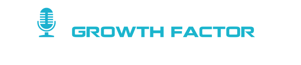
2. Podcast lockup (with microphone)
The wordmark with the microphone icon to the left. Use whenever the context is podcast-specific: episode cover art, YouTube thumbnails, podcast distribution platforms, podcast-focused social media. Transparent background, so it drops onto any dark surface (Azure, Deep Navy, photography with a dark overlay). The mic is cyan only, so this lockup is dark-only.
Podcast lockup
White "THE BUSINESS" + Azure "GROWTH FACTOR" + Azure mic. 1024×221, transparent. Drops on any dark surface (slate-900, Deep Navy, photography with a dark overlay). Don't place on Azure itself or the mic and bottom row vanish.
logo-podcast-transparent.png
3. Square wordmark (social shares)
The wordmark on a 1:1 canvas with breathing room above and below. Use as the Open Graph image for link previews on LinkedIn, X, Slack, iMessage, and for any 1:1 social post that needs the full brand name.
Square · On Light
1024×1024, transparent. Drop on white or any light surface.
logo-wordmark-square-light.png
Square · On Dark
1024×1024, transparent. Drop on slate-900 or any dark surface.
logo-wordmark-square-dark.png
4. Abbreviated mark (TB / GF)
The shortened mark. "TB" stacked on "GF" on a 1:1 square canvas. Use anywhere the full wordmark won't fit or won't read: favicon (this is what the site uses now), social profile avatars, app icons, watermarks. The brand's compact identity. Dark-only.
Abbreviated mark
White "TB" + Azure "GF". 768×768 square. Used as the site favicon.
logo-mark-dark.png
Bonus: Hosts duo
Cut-out photo of Lyndon and Josh with Azure outline on dark. Not a logo, but part of the brand asset set. Use it as a hero element in episode covers, presentation title slides, and on the homepage when the hosts are the story.
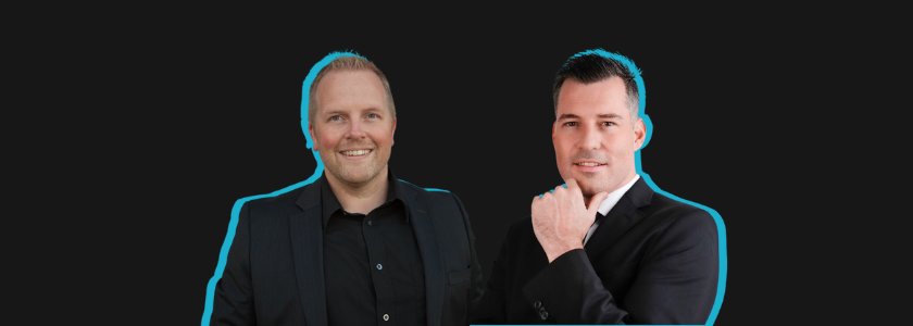
Hosts duo
840×300, opaque dark background. Don't crop tighter than the existing safe zone, and don't recolour the outline.
hosts-duo.png
Usage rules
Do
- Pick the variant that matches the context (podcast vs general, light vs dark, full vs abbreviated).
- Keep clear space around the logo equal to the height of the "T" in "THE".
- Scale proportionally. Minimum width: 120px on screen, 25mm in print.
- Place on backgrounds with strong contrast. White or near-white for the light variants; slate-900, Deep Navy, or Azure for the dark variants.
- Use the transparent podcast lockup over photography only when the image has a dark overlay for legibility.
Don't
- Stretch, skew, rotate, or recolour any logo variant.
- Add drop shadows, outlines, glow, or other effects.
- Use the podcast lockup (with the mic) outside podcast contexts.
- Recombine elements (mic + abbreviation, light wordmark on dark, etc.). The variants above are the only approved combinations.
- Use the wordmark below 120px wide. Switch to the abbreviated mark instead.
Colour Palette
The palette defines The Business Growth Factor's visual identity, ensuring consistency and cohesion across all platforms. It provides a strong, modern foundation with cool, professional tones, balanced by fresh and vibrant accents, reflecting growth, trust, and forward-thinking energy.
Primary
Black
HEX #000000
RGB 0, 0, 0
Primary text, headers, backgrounds, and high-contrast elements.
White
HEX #FFFFFF
RGB 255, 255, 255
Backgrounds, negative space, and secondary text on dark backgrounds.
Azure
HEX #1CB4CC
RGB 28, 180, 204 · CMYK 86 / 12 / 0 / 20
The key brand colour. Headers, highlights, icons, buttons, and digital accents.
Secondary
Mint Green
#ADEBB3
Fresh accent for graphics, infographics, and subtle highlight backgrounds.
Deep Navy
#0A2E36
Depth for large areas, hero banners, and contrasting sections.
Slate Gray
#6E7E85
Neutral tone for secondary text, dividers, and UI backgrounds.
Electric Blue
#006FBA
Bold accent for call-to-action buttons and key highlights.
Cool Silver
#D9E0E3
Light neutral for background blocks, overlays, and icon fills.
Bone White
#FAF8F2
Warm paper-like neutral. Subtler than pure white, for document backgrounds and long-form reading.
Approved Colour Combinations
Core Branding
Black + White + Azure
High contrast and instantly recognizable. Ideal for website headers, stationery, and presentations.
Cool Professional
Azure + Deep Navy + Cool Silver
Professional and tech-driven feel. Great for reports, corporate decks, and digital UI.
Fresh Growth
Azure + Mint Green + White
Optimistic and modern. Perfect for social media, infographics, and growth-focused messaging.
High Energy CTA
Electric Blue + White or Azure
Commanding and urgent. Ideal for buttons, links, and promotional banners.
Balanced Neutral
Slate Gray + Cool Silver + Azure
Soft and versatile. Works well for form backgrounds, email templates, and print materials.
Editorial Calm
Bone White + Slate Gray + Azure
Paper-like and considered. Ideal for working documents, collaboration frameworks, and long-form reading.
Colour Psychology
Why each colour earns its place in the palette, the emotional impact and brand message it reinforces.
| Colour | Brand Message |
|---|---|
| Black | Professionalism, stability, confidence |
| White | Transparency, trust, a clear path for growth |
| Azure | Growth, reliability, forward-thinking |
| Mint Green | Transformation, renewal, creative growth |
| Deep Navy | Authority, dependability |
| Slate Gray | Grounding, balance, visual restraint |
| Electric Blue | Urgency, focus, bold movement forward |
| Cool Silver | Professionalism, high-quality execution |
| Bone White | Paper-like quality, a quieter foundation for long-form material |
Typography
Two typefaces. Poppins for everything by default; Roboto Slab as an optional display accent. Both are free Google Fonts.
Primary Typeface
Poppins
Used for headings, body, buttons, and navigation. Weights in use: 300, 400, 500, 600, 700, 800.
Build Better Businesses
Build Better Businesses
Build Better Businesses
Build better businesses with practical systems and conversations from real operators.
Build better businesses with practical systems and conversations from real operators.
Display Accent
Roboto Slab
Optional for display lines where a more editorial feel is wanted, pull quotes, episode titles, book covers. Don't use for body.
Build Better Businesses
Build Better Businesses
Build Better Businesses
Kicker / Eyebrow
All-caps, wide tracking, Azure. Sits above headlines.
For the Entrepreneurs
Headlines
Poppins bold or extra-bold, tight tracking, ink color.
Where business leaders grow together.
Voice & Tone
We sound like two experienced operators having a useful conversation, direct, generous with knowledge, and grounded in real businesses.
We are
- +Practical. Concrete systems and examples.
- +Confident. Plain claims, not hedged.
- +Generous. Give the playbook, not the tease.
- +Grounded. Two decades of real operations behind every claim.
We are not
- —Hypey. No "10x" or "secret hacks".
- —Academic. No jargon for jargon's sake.
- —Vague. No mystical "mindset shifts" without substance.
- —Preachy. No moralising. Respect the listener's experience.
Instead of
"Unlock the secrets of 10x growth with our revolutionary mindset framework."
Say
"Six revenue drivers move the needle in most businesses. Here's how to figure out which one to work on this quarter."
Application
Common patterns you'll see across the site and in our materials. Match these when extending the brand.
Buttons
Always rounded-full. Primary fills Azure; secondary is white with Azure outline.
Brand Banner
Conversations about Building Better Businesses
Build · Grow · Learn
Azure background, white type, motto in wide-tracked all-caps.
A few things to avoid
- × Recoloring the logo to non-brand colors
- × Introducing accent colours outside the canonical palette (orange, red, magenta, etc.)
- × Setting body copy in Roboto Slab
- × Square-cornered buttons (we use rounded-full)
- × Drop shadows on the logo or wordmark
- × "TBGF" as a public-facing abbreviation
Downloads
Grab everything at once with the brand pack, or pick up individual files below.
One click, everything
TBGF Brand Pack
All four logo variants (light + dark) + the hosts photo + the full favicon set + a README with the colour palette, typography, and usage rules. ZIP, ~500 KB.
Or pick up individual files
Wordmark, On Light
PNG · transparent · 1024×210
Wordmark, On Dark
PNG · transparent · 1024×211
Podcast Lockup, Transparent
PNG · transparent · 1024×221
Abbreviated Mark (TB / GF)
PNG · solid black · 1024×768
Square Wordmark, On Light
PNG · transparent · 1024×1024
Square Wordmark, On Dark
PNG · transparent · 1024×1024
Hosts Duo (Lyndon & Josh)
PNG · opaque dark · 840×300
Need something else?
Press kits, podcast cover art, host bios & headshots, or a vector version of the logo for print, just ask.
Get in Touch